My introduction to graphic design was staring up at a Beatles poster on my bedroom wall aged 8, wondering why the vertical stroke of the T dropped below the baseline of the band’s name. I had no understanding that what I was pondering was actually called typography, nor that the words graphic and design existed. Nevertheless, it sparked an interest in why certain decisions were made about how things looked.
Later, between the ages of 11 and 13, I became fascinated with 2 Tone bands and their visual form. At middle school, playground tribes would write band names on their canvas bags and note books, and try to do so as accurately as they could to how they appeared on album sleeves. My bag was covered with the names of The Specials, Madness and The Selecter, bands on the 2 Tone Records roster.
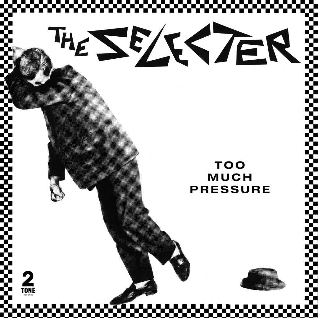
Such was the task of trying to draw the band names that I would practice by tracing them off album or cassette sleeves, to the extent that when I pull out those records from my collection today, I can see faint outlines around the lettering where I traced with a ball point pen—too much pressure, indeed!
The record that encapsulated the identity of all the 2 Tone bands for me was the live album Dance Craze, released to coincide with the film of the same name. On its cover was a pair of tasselled loafers below black and white checker squares socks, designed by John ‘Teflon’ Simms. Alongside these were all the band names who appear in the film and soundtrack, rendered in their individual stylings.
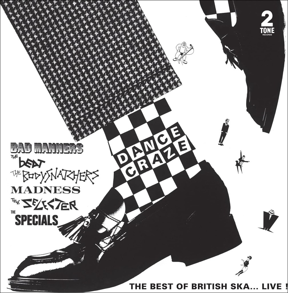
That all of these band titles were in one place fascinated me. There was a visual link between them in stark black and white, but each band’s logotype had its own identity. Jerry Dammers, 2 Tone founder and The Specials keyboard player and chief songwriter, always claimed he wanted the label to be like an English Motown and to use it to introduce new bands.
What intrigued me at the time, much like questioning the T of The Beatles, were the graphic decisions being made: why was The Beat written in upper and lower case letters? Why were The Bodysnatchers drawn as if part of a simple dot-to-dot puzzle? Why were The Selecter characters so spiky and angular? While I could hazard a guess at the answers to these questions now, the specifics seem less important with age. What I ruminate on now is the impact of gaining, at such a young age, an implicit understanding of the idea of what a visual identity is, and that it is possible to carry a sense of individuality within an overarching brand.
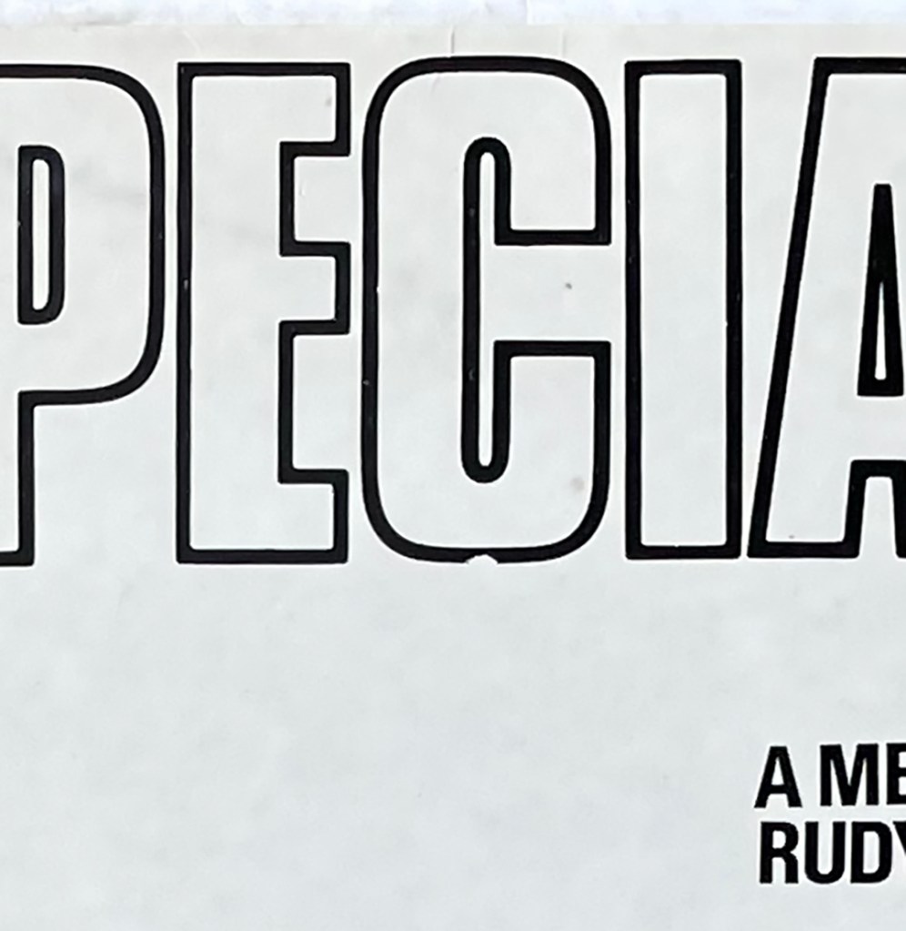
I have thought about these formative learnings many times since becoming a graphic designer, and what my introductions to the concept of visual communication were. However, one aspect of the 2 Tone sleeves had alluded me for many years—that was the question of why, on The Specials first and second albums, is a small section the C missing from their name?
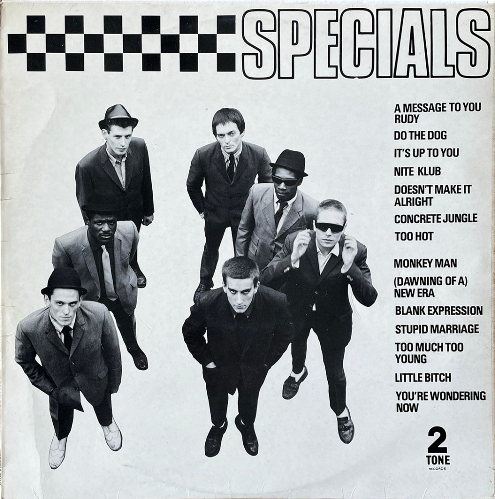
I was aware of Letraset from a young age and had played with samples of it my dad bought home from work, so I understood that it wasn’t always possible to achieve a perfect ‘rub down’, through either too light a touch, or too heavy a one. But surely, I thought, you would re-do that letter for an album release, it being easy to pick off one character with a sharp knife and add another. To let the same artwork carry through to a second release had me pondering whether this was simply a slip of the hand, or a deliberate act. If the latter, it was beyond me why that would be the case.
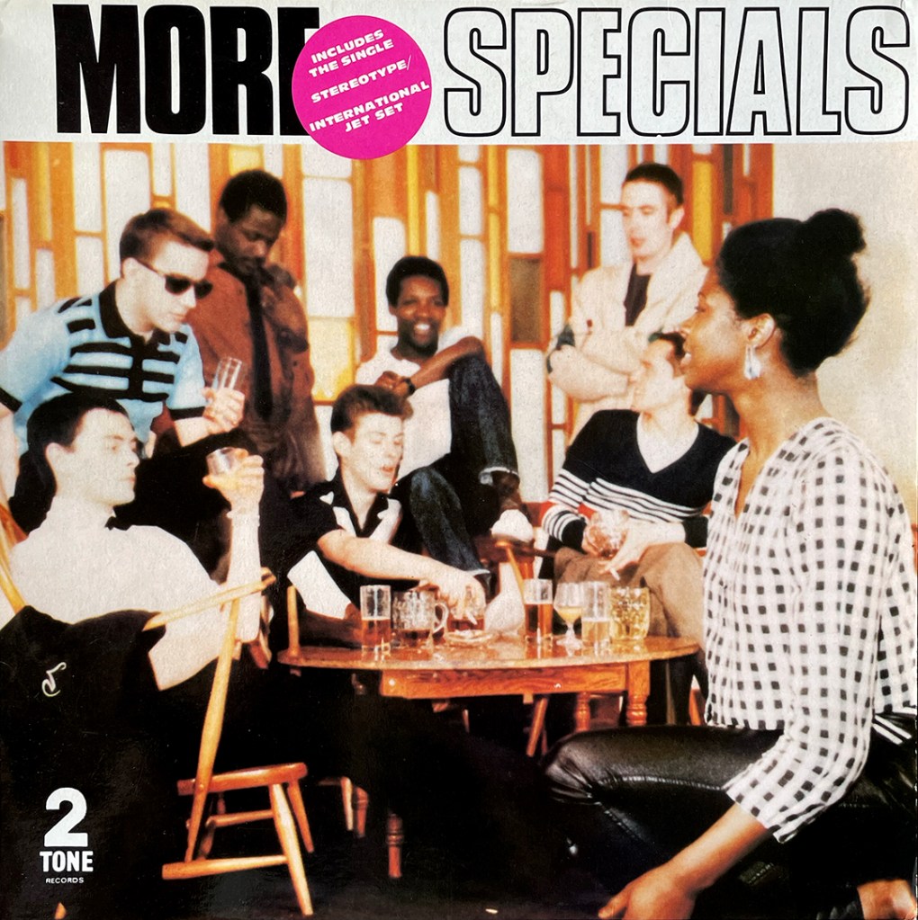

My years of wondering were answered recently, when I read Daniel Rachel’s Too Much Too Young: The 2 Tone Records Story. Photographer Chalkie Davies says: “To create the band logo, [Carol] Starr used Letraset and, as per Jerry’s instruction, made the lettering bold, heavy and non-descript.” (p116, Rachel, 2024) Insisting on an oversight of everything, Jerry Dammers was very involved in the design process, and Starr continues: “…the final request was the inclusion of seven deliberate mistakes. They included ‘roughing up’ the typography to include smudges and uneven lines, listed song titles running ‘downhill’ and a nick clipped into the base letter ‘C’ of Specials. We had become Davies & Starr, but Jerry thought that was impersonal, so I suggested taking a little bit out of the band lettering.…”, and chose the C in reference to the initial of the photography/designer partner’s first names.
A 44 year old mystery is solved.
References
Rachel. D. (2024) Too Much Too Young: The 2 Tone Records Story. White Rabbit: London
The 2 Tone label artwork: https://2-tone.info/the-2-tone-label/
Interview with John ‘Teflon’ Sims: http://marcoonthebass.blogspot.com/2009/11/exclusive-interview-with-john-teflon.html

You must be logged in to post a comment.