When colleagues bought me Chris van Tulleken’s Ultra-Processed People as a recovery read while I was off work recently, I didn’t expect a book about food to have so many of its pages dedicated to graphic design. But alongside advertising and marketing, visual communication is mentioned enough times for me to liberally tab many of its pages and take notes as I read.

Ultra-Processed People is about Ultra-Processed Food, (UPF), defined by Van Tulleken as ingredients in processed food that you wouldn’t have in your kitchen. Subtitled Why do we all eat stuff that isn’t food…and why can’t we stop?, big claims are made from the outset with the book jacket stating: “We have entered a new ‘age of eating’ where most of our calories come from a novel set of substances … products which are industrially processed and designed and marketed to be addictive.” The introduction goes on to list the harms of UPF, and that it:
…damages the human body and increases rates of cancer, metabolic disease and mental illness, that it damages human societies by displacing food cultures and driving inequality, poverty and early death, and that it damages the planet. The food system necessary for its production, and of which it is the necessary product, is the leading cause of declining biodiversity and the second largest contributor to global emissions. UPF is thus causing a synergistic pandemic of climate change, malnutrition and obesity., (p6, Van Tulleken, 2023).
Despite the weight of these claims, the book is an accessible read, with Van Tulleken displaying the same approachable and friendly tone throughout that will be familiar to anyone who has seen him on television or heard him on a podcast. As an infectious diseases doctor and Associate Professor, a concern could be that the book would be dry and academic, but he manages to make Ultra-Processed People engaging, largely because it is a deeply personal study of a topic he is passionate about—Van Tulleken puts himself through research tests, and talks openly about his family, his eating habits and his relationship with his twin brother. It is, however, scientifically researched and evidence based, with him interviewing specialists around the globe, visiting communities whose culture and health have been impacted by UPF products, and pulling apart historical and contemporary research papers and experiments on the topic.
So where does graphic design come in? The first occasion is relatively early on when Van Tulleken reflects on a conversation with his three-year-old daughter over breakfast. The author decided to take part in a personal experiment while writing the book where he replaced 80% of his diet with UPF products, and documents what happens to his health.
…I had begun my UPF diet with a breakfast of Coco Pops.
‘Is it for me?’ asked Lyra. No I told her. She was having porridge.
‘I want the Mickey Mouse cereal!’ Lyra said, pointing at Coco Monkey.
I had assumed that, having never tried Coco Pops, she wouldn’t have any interest in them. But Kellogg’s had got her hooked before she’d had a mouthful. She knew that here was a product designed with a three-year old in mind., (p30, Van Tulleken, 2023).
From this simple case study at a breakfast table, the cartoon monkey on the packaging clearly grabbed the attention of his daughter, and the inference that Van Tulleken makes is that this was its exact function.
While using visuals to market breakfast cereals at children are prevalent on food packaging, the food industry does try to use graphics to provide healthy eating guidance. In the UK there are strict guidelines about food labelling, and systems have been devised, such as ‘traffic light’ colour coding and nutritional data tables, to help consumers make their own informed decisions. Van Tulleken questions the effectiveness of these devices, thinking them to be a blanket tool with too little detail, whilst also being overshadowed by the visual dominance of other images on the packet:
As Lyra lifted her second bowl to carelessly slurp the brown dregs of milk, I started to think that nutritionism wasn’t very helpful for trying to work out how much or what she should eat. Had she eaten too much sugar for a child of her age for instance? … And the pack didn’t say how many grams of Coco Pops were OK for a three-year-old, which seems odd given that so much space on the box is devoted to a cartoon monkey that markets the product directly to children., (p38, Van Tulleken, 2023).
He goes on to analogise the failings of the traffic light system:
Those nutritional ‘traffic lights’ (two green, two amber) started to seem more and more absurd as I watched her. In the UK, this system of highlighting the levels of fat, saturated fat, salt and sugar is entirely voluntary (many other countries have similar systems). But imagine driving a car with a three-year-old in the back seat and being faced with four lights, two of which are green and two of which are amber. Do you drive or not?, (p38, Van Tulleken, 2023).
Van Tulleken isn’t the only person to raise concerns about unhealthy food being marketed directly at children through advertising and graphic design. A recent article in The Guardian about Bite Back, a Jamie Oliver campaign group, says: “Oliver has accused food manufacturers of deliberately using packaging that is designed to ‘capture young minds’ in order to sell more junk food.” Citing research by food experts Action On Salt at Queen Mary University of London, criticism is backed up rather than anecdotal, as in Van Tulleken’s breakfast table experience. Action On Salt’s research discovered:
- 78% of products were deemed unhealthy because of their fat, salt or sugar content.
- 67% of those featuring a [cartoon] character were unhealthy.
- 80% of products used bright colours as well as fun patterns and lettering to attract children’s attention.
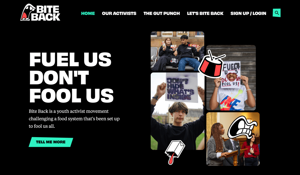
As Bite Back are reported to say in the article: “Some businesses are using child-appealing packaging to push unhealthy products to children. Offenders include Kinder Surprise, M&Ms, Randoms and Monster Munch Giants—all hiding behind colourful, child-appealing wrappers while stuffing their products with sugar and fat.” Jamie Oliver said: “Whether it’s through fun characters, bright images or exciting new shapes, these switched-on companies are choosing them because they know they will capture young minds.” As could be expected, the food companies cited by Bite Back in The Guardian have denied they deliberately target children through the graphics on their packaging.
Using a cartoon monkey to entice a three-year-old that a breakfast cereal is for them is just one of marketing’s semiotic persuaders, and adults shouldn’t think that they are immune to graphic influencers. Things can be made to look healthy through a careful choice of visual codes, just as much as they can be made to look appealing for children through cartoon characters. When on a camping trip with his brothers and some friends during the second weekend of his UPF experiment, Van Tulleken recounts:
Ryan, an internationally renowned psychology professor from Australia, was astounded to see I was eating Alpen on my UPF diet: ‘What’s wrong with Alpen? It’s natural and wholesome.’ I told him that it technically qualified as UPF because it has milk whey powder in it, an ingredient that isn’t typically used in home cooking.
He looked genuinely baffled. ‘But the mountains on the pack look pristine!’ … If the packaging can persuade Ryan, it can persuade anyone., (p52, Van Tulleken, 2023).
One of the underlying tenants Van Tulleken is at pains to express throughout the book is that those ‘addicted’ to UPF should not be blamed for their lack of willpower, or for ‘living with overweight’—a phrase he uses repeatedly to try to destigmatise those too readily labelled obese or overweight—and a tagline employed in advertising the book is: ‘It’s not you, it’s the food’. Making a statement about which food types are advertised and which are not, he points out that it is mostly UPF products that have intensive marketing strategies applied to them. While investigating a scientific study involving two groups of people, one eating UPF products and the other not, he observes how the study doesn’t take into account the impact of advertising:
The UPF foods weren’t marketed to the participants during the study. There were no posters or health claims, and the food had been removed from its packaging covered in attractive photographs. In the real world, part of the processing is that packaging and the adverts, which are nearly universally for UPF. You almost never see an ad for beef or mushrooms or milk, and there are no health claims on their packaging. But you do see cartoon characters and vitamin-enriched claims printed all over UPF., (p58, Van Tulleken, 2023).
When saying: “…part of the processing is that packaging and the adverts…”, (my emphasis), Van Tulleken is suggesting that graphic design and advertising are a part of the UPF ingredients, because they are as much responsible for the desire for people to eat UPF products as the taste and convenience of them are.
The problems extend well beyond packaging though, as highlighted when Ultra-Processed People discusses the issue of ‘food swamps’. These are where “fresh food may be available, but it is submerged in a swamp of fast-food outlets selling UPF.”, (p140, Van Tulleken, 2023). For a BBC 1 documentary on Ultra-Processed Food, Van Tulleken recounts:
I went to Leicester to meet a group of teenagers to understand their food environment. They showed me exactly how food swamps work.
They took me to the Clock Tower, the central landmark where all the young people go to hang out, and pointed out the shops in the immediate vicinity: McDonald’s, Five Guys, Burger King, KFC, Greggs, Tim Hortons, Taco Bell, another Greggs, Pizza Hut, a chicken shop, Costa, Awesome Chips—and there’s yet another Greggs just out of sight next to a Subway. McDonald’s has the prime location, right at the foot of the Clock Tower.
Leicester is a food swamp. UPF is everywhere but real food is harder to reach, both geographically and financially. There is a clear correlation between poverty and the density of fast-food outlets, with almost twice as many in the most deprived areas compared with the least., (p140, Van Tulleken, 2023).
While in this instance Van Tulleken doesn’t specifically mention anything related to graphic design, it doesn’t take much imagination to picture the abundance of brightly lit signs and branded shop window graphics that are imposed on public spaces by fast-food chains, such as those he witnessed in Leicester. All of which are designed to compete with competitors and entice customers into their outlets.
In terms of urban studies, this can be related to environmental ‘determinism’, which Kim Dovey explains in Urban Design Thinking, as “…the idea that environment can determine or cause certain kinds of behaviour; implying that if we change the built environment, then we will cause better behaviour.”, (p41, Dovey, 2016). While here Dovey suggests better built environments can create better behaviour in people, it doesn’t take much to reverse that concept and conclude that poor built environments can cause poor behaviour in people. By allowing an area in a city where teenagers have always hung out to fill with a predominance of fast-food outlets—all with demanding graphics—poor nutritional decisions in a food swamp are exactly what the teenagers Van Tulleken met are likely to make, something I would term as ‘visual environmental determinism’.
Alongside urban environments, Ultra-Processed People looks at how all-encompassing marketing strategies can be and how the concept of a food swamp extends beyond the specifics of the locale. While still in Leicester, he reflects:
The swamp isn’t just the density of restaurants. It’s also the total immersion in marketing. The teenagers showed me their bus tickets, which are also vouchers for McDonald’s. Their social media feeds are crammed with ads for these same brands and so are their games … All media they consume is funded by the fast-food industry. They’re soaked in the advertising that we know works., (p140, Van Tulleken, 2023).

Food manufacturers will claim that this isn’t their intention, nor their fault, as already witnessed in the previously mentioned article in The Guardian. Backing up his claim that we know advertising works, Van Tulleken says: “You will often hear those in favour of deregulation argue that advertising doesn’t promote excess eating, that kids are already buying a burger and the advertising merely suggests to them which one they should buy.” Such a defence is unsurprisingly similar to the one employed by ad agencies prior to the ban of cigarette advertising in the UK, and Van Tulleken discounts it out of hand saying bluntly: “The argument is incorrect.”
Perhaps the most definitive evidence showing that advertising food, and especially junk food, makes children eat more comes from a paper by Emma Boyland, a professor of food marketing and child health. Boyland did a comprehensive review, commissioned by the World Health Organization, to inform the development of updated recommendations to restrict food marketing to children. She looked at data from nearly 20,000 participants across eighty different studies and showed, beyond all doubt, that food marketing is associated with very significant increases in children’s food choices, food intake, and food purchase requests … The only products advertised to young people like the ones I met in Leicester are UPF., (p141, Van Tulleken, 2023).
In one of my graphic design classes I run a debate with first year students about ethics and social responsibility in graphic design, and I ask them what their ‘red lines’ are—in other words, what issue do they feel strongly enough about that would make them refuse to work on a project which related in some way to that issue? Often environmental concerns are mentioned; many would draw the line at promoting smoking; but working on anything remotely racist is probably the most popular red line. No one has ever mentioned anything to do with food packaging though, and the examples set out in Ultra-Processed People provide me with plentiful examples for the next time I run such a debate. This is especially the case for when Van Tulleken marries the topic of racism and food packaging, given its rightful abhorrence in students:
More troubling to me than the dimethylpolysiloxane were the graphics on the packaging, which as a teenager I’d never thought about. I was eating KFC a few months after the murder of George Floyd by a Minneapolis police officer, Derek Chauvin. The US and British history of enslavement was being discussed everywhere, and someone who looked like a Confederate colonel appeared to be on my chicken box., (p245, Van Tulleken, 2023).
While the examples discussed so far could make Ultra-Processed People seem overly pessimistic, towards the end of the book the author mentions an ambitious graphic intervention in Chile that directly legislates against marketing unhealthy food to children, and uses visual devices to try to reverse the trend. In fact, they use the complete opposite of a traffic light coding system. “In 2016, Chile implemented a set of policies that put marketing restrictions and mandatory black octagonal labels on foods and drinks high in energy, sugar, sodium and saturated fat.”, (p299, Van Tulleken, 2023). This is an effective visual method; instead of the consumer needing to decode ambiguous graphic messaging, the simple black label sends an unambiguous and universal signal that a product is unhealthy.
Further restrictions also forced the hand of what food manufacturers could include on packaging, as Chile “removed cartoon animals, including Tony the Tiger and Cheetos’ Chester Cheetah, from packaging.,” (p299, Van Tulleken, 2023). The fact that this has been brought in with the will of the consumer, makes for further positive reading. Van Tulleken eulogises: “It was a masterclass in the technical side of policy making, developed in consultation with the public and then tested and trialled. All participants in lay group meetings wanted clear labelling.”, (p300, Van Tulleken, 2023).
The results are clear, the negative impact that graphic design can have on the choices consumers make is proved by a turn-around in behaviour through the forced reversal of graphic marketing gimmicks: “The labelling has had a huge impact, with decreases in food purchases and, perhaps most significantly, research showing that the regulation made children ask their parents not to buy products.”, (p300, Van Tulleken, 2023). This is an incredible about-turn, the complete opposite of what is known as ‘pester power’, where children are encouraged to nag their parents to buy something and parents give-in for the sake of a quiet life.
When I started reading Ultra-Processed People I didn’t expect it to be about graphic design. And in reality, it isn’t; the instances mentioned here, whether talking about graphics directly or indirectly, are the only occasions in a 304 page book. However, the relationship between cause and effect of Ultra-Processed Food marketing are clearly linked, evidenced by the examples provided. There is an argument to be had, and Van Tulleken intimates this on occasion, that without graphic design, advertising and marketing strategies, there would be a lot less people eating these unhealthy products, and therefore a lot less harm would be done to people throughout the world. While Van Tulleken is trying to encourage the food industry to be accountable and to take seriously its social responsibilities, running alongside this throughout Ultra-Processed People is a strong argument that graphic design and advertising in this sector should do the same.
References
Bite Back. (2024) Bite Back (Available at: https://www.biteback2030.com) Accessed: 13 May 2024
Brand For Brands. (2024). How Brands Can Cash In On Pester Power (Available at: https://brandforbrands.com/how-brands-big-and-small-can-cash-in-on-pester-power/) Accessed: 13 May 2024
Campbell, D. (2024) ‘Unethical’ junk food packaging manipulates children into craving sweets, report claims (Available at: https://www.theguardian.com/food/2024/may/02/unethical-junk-food-packaging-manipulates-children-into-craving-sweets-report-claims) Accessed: 13 may 2024
Dovey, K. (2016) Urban Design Thinking: A Conceptual Toolkit Bloomsbury: London
Politics.co.uk. (2024) Tobacco Advertising (Available at: https://www.politics.co.uk/reference/tobacco-advertising/) Accessed: 13 May 2024
Van Tulleken, C. (2023) Ultra-Processed People: Why Do We All Eat Stuff That Isn’t Food…and Why Can’t We Stop? Cornerstone Press: London

You must be logged in to post a comment.