This month, Just For One Day: The Live Aid Musical, opens at The Old Vic in London. While in 1985 the focus of the original Live Aid was all about raising money for famine-struck Ethiopia, despite Just For One Day giving 10% of all profits to The Band Aid Charitable Trust, nostalgia appears to be the real motivating force in 2024. The Old Vic website states the show captures, “…one moment [that] made the world stand still and brought 1.5 billion people together – and they all have a story to tell about ‘the day rock ‘n’ roll changed the world’.” Given the state of world affairs today, the idea that rock ‘n’ roll ever changed anything other than the bank balances of those within the record industry, demonstrates at best, a sense of naivety.
By coincidence, when recently sorting through some old boxes, I came across my 1985 Live Aid programme. I proceeded to spend a fair amount of time leafing through it, pondering not just the event itself, but the graphic design of the day, as captured in this philanthropic visual time capsule.
First some context—I sort of found myself at Live Aid accidentally. I received a phone call from my brother the evening before the event, offering me a ticket after a friend of his had broken their arm and couldn’t go. I had seen the unfolding hype around the event, and was watching a ‘setting-up the stage live from Wembley’ news item at the very moment I received the call. But as a spiky teenage punk, the majority of the acts playing did not particularly interest me. However, I jumped at the chance to experience the spectacle first hand, even if I had to sit through Status Quo and Dire Straits to see David Bowie and The Who.
Looking back at the programme now, I can view this graphic artefact through a different lens to my 17 year-old self. My memory of it was that it was akin to The Face in regards to layout, but on looking at it again, the design proves to be a mix of different mid-1980s aesthetics, but tamer than I expected—it looks more like Smash Hits to my eyes now. It is clearly trying hard to speak to a broad audience, and it obviously needed to look sober enough to respect the human tragedy behind the event, while also giving off an air of excitement and ‘cool’, to appeal to the those that were at Wembley that day. The programme was another part of the money raising effort after all.
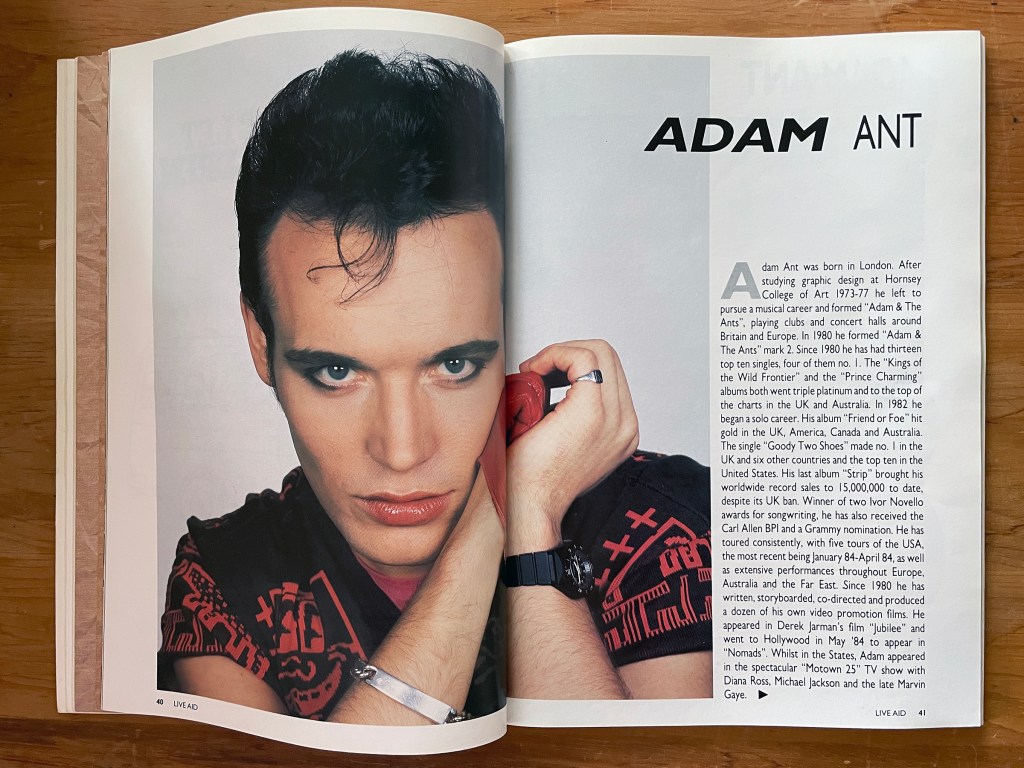
The Adam Ant and David Bowie spreads are typical of many of the artist feature pages: large press-release photos, mixed weight and italicised display fonts, drop caps and justified body text. I can’t help but think that today, rather than supplying pre-existing press shots, artists might have bespoke photographs taken specially for such a publication. But 1985 was obviously pre-digital photography and the programme had to be produced in a rush. Wham!’s management did manage to secure a double page photo though—one page for each of the boys.


The artist pages are interesting, but it was brave to open the programme with hard-hitting photography by David Bailey, making sure that the musical spectacle that was about to unleash itself on the world remained rooted in its humanitarian cause.
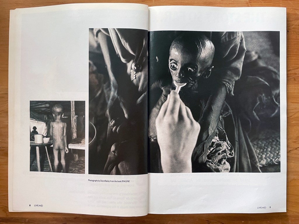
David Bailey photos from the book IMAGINE.
After Bailey’s harrowing shots, and sandwiched between an article about the recording of the original Band Aid single and the artist biographies, are 12 pages about the human tragedy happening half-way around the world. While sobering, looking at this in 2024 it is apparent that these, and Bailey’s photographs, are almost the only photos you see of black faces throughout the entire image laden 162 page publication. The only exceptions to this I could find are of Sade in her feature page, and five artists in the group shot of the original Band Aid recording.

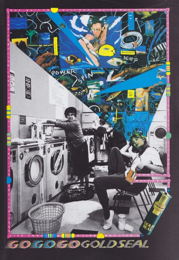
Naturally, such an event couldn’t exist without sponsorship, and it is interesting to see throughout the programme how advertisers and brands responded. Some just ran existing ads with no relevance to the event itself. Many exhibit stylistic traits typical of the period, such as this psychedelic illustrated collage for Ever Ready, playing to the Sony Walkman trend in full swing at the time.
In a TDK advert it is nice to see George Hardie’s work featured, and interesting to note the rare illustrator credit in an item of advertising.

Some advertisers went out of their way to produce something that reflected the day though. Although some simply provide a brief reference by adding a caption at the bottom of an existing campaign, others designed something specifically for the event, such as this ‘rocking all over the world’ illustration by CBS.


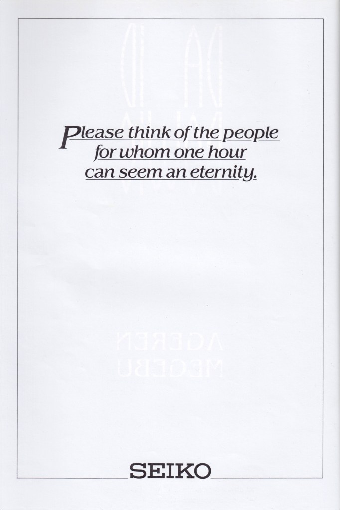
There is something rather cringe-worthy and embarrassing about the above CBS and British Rail adverts though, as they seek to overtly make it about them, rather than about the cause. By comparison, the Seiko and Abbey National adverts below are respectively thoughtful, providing a moment of reflection, and wishing the event luck.

I specifically like the following double page spread, where a fullcap typographic statement, (with more than a nod to a Katherine Hamnett slogan T-shirt), sits uncomfortably against an achingly cool postmodern WEA advert. All kudos to whoever sequenced these pages to drive home the idea that the statement needs to be heard.

The strangest thing to see in looking back at advertising from the 1980s though are adverts for cigarette brands. The irony cannot be ignored that these appear in a publication that proudly states on its front cover: “This Programme Saves Lives”. While the cover may carry that bold statement, the back cover featured an advert for Marlboro.
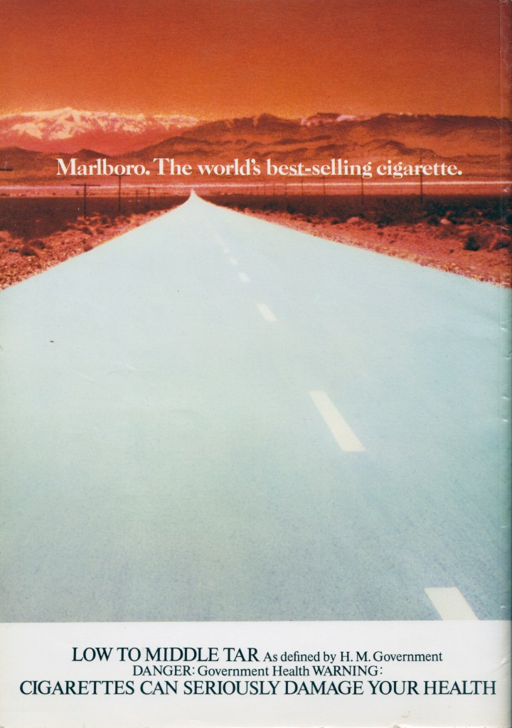

Imperial Tobacco, who may have seen double standards at play, simply ‘donated’ their space. My inner cynic can’t help but think this an early case of ‘purpose’—they could simply have donated money to Live Aid and allowed someone else to have the page for a better cause. But sometimes dirty companies just want to look clean.

Finding this programme again prompted me to dig out Chumbawamba’s 1986 album, Pictures Of Starving Children Sell Records. Starvation, Charity and Rock & Roll. Lies & Traditions., and consider their take-down of the bands and artists that played the event. That is some title for a record, and some sleeve design. The back cover is dedicated to anticapitalist rhetoric, quotes and lyrics. The entire album, the band’s first release, is an anarcho-punk concept album of sorts, aimed squarely at artists propping up the capitalist system that causes, in Chumbawamba’s mind, an unequal world, uneven distribution of resources, and that profit from the African slave trade and the growing of cash crops, that all helped to create the very famine that Live Aid sought to alleviate.


Listening back to Pictures of Starving Children… while flicking through the Live Aid programme, full of photographs of rich pop stars signed to profit driven record labels and multinational corporate advertising, I can’t help but think that Chumbawamba make some fair points.
The experience of leafing through the programme again though, sadly just brings to mind how little has changed—such human tragedies are still happening, as much because of climate change as anything else, and inequality is still ever present around the world. This is why the nostalgia driven statement that ‘rock ‘n’ roll changed the world’ back in 1985 sticks in the throat, and I am very mindful of the fact that the name of the band who opened Live Aid were Status Quo.

Live Aid Programme credits—
Design: Richard Gray for Ostrich Graphics
Typesetting: Spectrum Typesetting Ltd
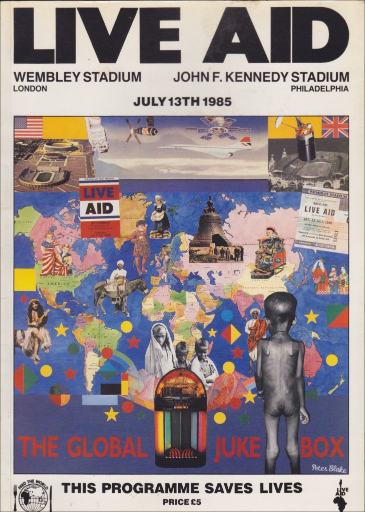
Front cover collage: Peter Blake, (w/ b+w photo by David Bailey)
Front cover graphics: Richard Gray and Gordon House
Live Aid logo: David Hastings Associates
Ethiopian photography: Bob Geldof

You must be logged in to post a comment.