I didn’t think I knew Bob Linney. It turns out though that I did—he was the mysterious designer behind a print that had been hanging in our house for some time.
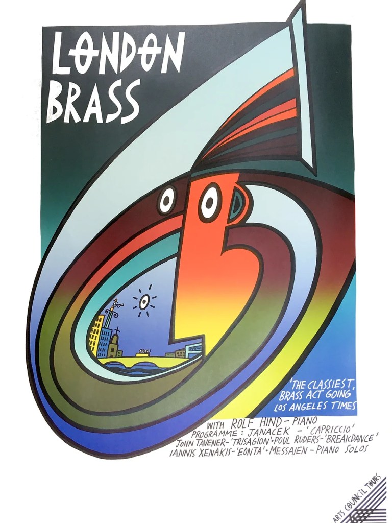
Bought by my wife from an antiques centre several years ago, his London Brass poster had hung on our landing wall until, on moving 3 years ago, it was given a more prominent position in our new dining room. I’ve been staring at it over breakfast ever since. Unsigned, I was intrigued who had designed the poster, and despite many Google search terms such as ‘London Brass’, Arts Council Tours’, ‘Rolf Hind’, and the various other musicians names it mentions, I couldn’t find out who had designed it.
That was until two weeks ago in a bittersweet moment of discovery and loss when I read Bob Linney’s obituary in The Guardian. Thinking there was something familiar about the images used to illustrate the piece, I Googled his name, found a website selling original posters and saw the London Brass print online staring back at me.
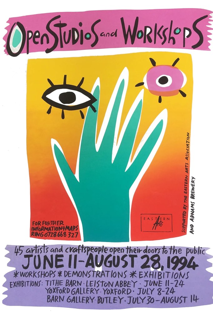
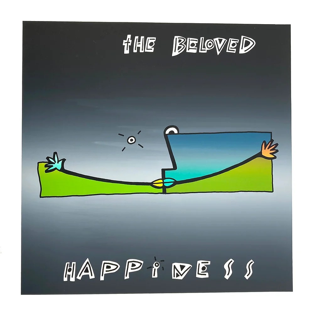
Looking through this archive, it became apparent there were other familiar items in the breadth of his output: the Suffolk Open Studios pareidolia graphic that I have seen annually for many a year, and carried it around on the booklet it adorns when we’ve visited artist studios in the region; and the artwork for The Beloved, never a band I had actively listened to or bought their records, but I knew their sleeves; and much more besides. I was kicking myself that I hadn’t come across his name before, or associated it with much of the work I now saw before me. That he lived 30 miles up the road in Walpole, Suffolk, was even more frustrating.
There is lots else that is familiar in his work, now that I look at it as a collection. The influences, to my eyes, range from Picasso to Javier Mariscal; from MTV idents of the 1980s to Keith Haring, and much more besides. While these reference points that come to my mind are all international, there is something very British about Linney’s work.
In many posters the image takes priority over everything and the lettering is squeezed in the remaining available space, sometimes rubbing right up to the edge of the frame; I assume that the typography was an after thought, with the image being the main starting point for much of his work. There is more control in The Beloved layouts, but they lack none of the vibrancy elsewhere—there is a joyful looseness and abstract freedom in what he did, and a fluid vibrancy that mimics graffiti and tagging.
In many respects his work is stylistically situated very much in its time of production, but there is also something about looking at them now that seems very contemporary. The resurgence in the use of gradients, maybe. They are for me though, an antidote to the pixel and vector driven aesthetics of Procreate and Adobe Illustrator, where the software often forces the look of the work, especially in the hands of young design students who have very limited experience of exploring analogue image making processes.
Beyond his creative work though, Bob Linney was proactive in encouraging non-artists in developing countries to use visuals for the betterment of their communities. He set up the charity Health Images in 1983, and travelled Africa and Asia teaching people how to make visual aids in extremely limiting circumstances. Writing in his 1995 book, Pictures, People and Power, he said: “Visual aids can support processes of empowerment. You do not need to be a trained artist, nor even particularly good at drawing and painting, to make such pictures.” He championed a ‘people-centred’ approach to empowerment, saying that this tries: “…to relate closely to the agenda of the people”, (1995, Linney, p2), rather than having someone else’s agenda forced on them.
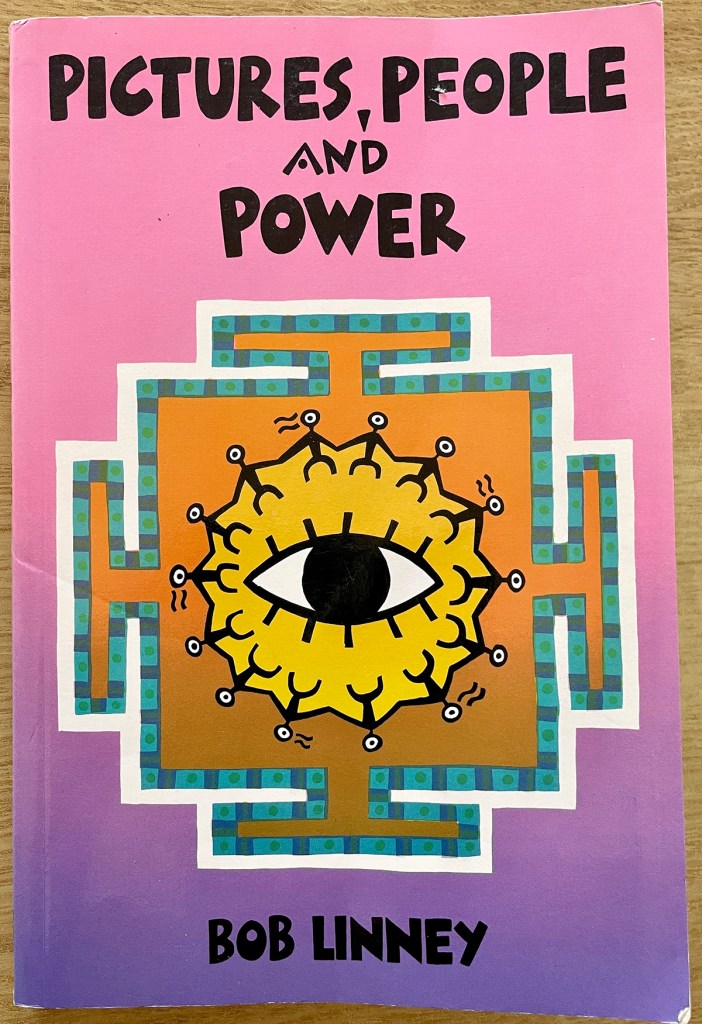
I have been lucky enough to pick up a copy of Pictures, People and Power in the last week, and it is a fascinating read, one that every art and design lecturer in the country should spend some time with in my opinion. It is a provocative take-down of authoritarian pedagogies. The book’s introduction quotes David Werner: “…the very idea that you or I can empower someone else contradicts the process of empowerment, which is something people do for themselves. Empowerment cannot be given or taught. It must be taken.”, (1995, Linney, p2). This humanitarian, anti-elitist and bottom-up approach is, in my view, more closely aligned to anarchist philosophy than the leftist views often prevalent of designers working in the cultural sector during the Thatcher years as Linney was. Pictures, People and Power is all the more refreshing for this.
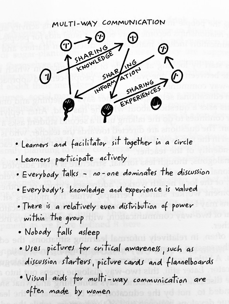
Linney concludes the title’s introduction by saying: “There is a political dimension to working with visual aids which aim to promote development. Education and communication are never neutral. … Pictures can help people to read the world. Suitably designed visual aids can initiate the process by which oppressed people develop a critical awareness of their own reality. Reading the world is the first step towards taking action to change reality. Paulo Freire wrote that ‘people must learn to read their own reality and write their own history’. Pictures can help in both these processes.”, (1995, Linney, p3).
Reflecting on this, I cannot help but think that Linney’s ideas put into practice what Ken Garland was suggesting designers should do when he wrote the First Things First manifesto in 1964, saying that there must be better uses of a designer’s skills than feeding the advertising industry. Bob Linney epitomises this in many ways. I’m sorry to have come to learn his name only shortly after he passed, but I am pleased I have now, and that he is continuing to inspire and educate from beyond the grave. I will be taking much of this teaching into my own, and making sure that students know his work.

2 thoughts on “Finding Bob Linney”
Comments are closed.